
SKT Matrix Design - Grid Style WordPress Theme

- The most recent update was made in October 2026
- Using the most recent version of WordPress
- The Google fonts have been updated to comply with GDPR and other privacy regulations
- This version is compatible with PHP 8+
- This update is designed to work with at least one page builder (Elementor or Gutenberg)
- This WordPress theme is compatible with popular plugins such as SEO, contact forms, and WooCommerce
- Improvements to performance for popular cache plugins and Cloudflare
For Original price was: $69.00.$41.00Current price is: $41.00.
For Documentation: Click Here
Grid Style WordPress Theme
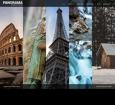
Our Grid Style WordPress Theme is designed for blogs, portfolios, magazines, and creators seeking a cleaner and more organized online experience. It includes features like responsive layouts, image-focused sections, flexible grids, organized content flow, and many more.
This theme combines clean design, image-focused sections, and fast performance to help create a website people enjoy spending time on. This theme integrates with industry-standard WordPress plugins.
Website owners who want stronger visual presentation may also find ideas in a Portfolio WordPress Theme because structured layouts often make content easier to browse and more enjoyable to explore.
Who Can Use SKT Matrix Design Theme?
Bloggers
Publish articles in a format that keeps reading simple and organized.
Photography Creators
Display visual work without making pages feel crowded.
Online Magazines
Your content can reach audiences beyond your local location .
Portfolio Owners
Arrange and display all your projects in a neat and clean way.
Creative Studios
Show work and updates through visual sections.
Designers
Build websites where layout becomes part of the experience.
Content Publishers
Keep articles and media arranged naturally.
Personal Brands
Create a website that feels modern and easy to explore.
Outcomes of Using Our Keyword Grid Style WordPress Theme
Makes Content Easier to Discover
Visitors can scan sections quickly and choose what interests them.
Creates Cleaner Visual Flow
Content feels more balanced across the page.
Helps Images Get More Attention
Grid layouts naturally support visual presentation.
Improves Reading Experience
People spend less effort understanding page structure.
Supports Faster Browsing
Visitors move from one section to another comfortably.
Works Better Across Devices
Layouts stay organized on mobile and desktop.
Keeps Websites Looking Modern
Simple structure often feels more professional.
Encourages Longer Sessions
People explore more when pages feel comfortable.
Supports Content Growth
Add more posts without making pages messy.
Useful Features of Our Grid Style WordPress Theme
Adaptive Grid Expansion
New content fills available spaces automatically and keeps the layout visually consistent.
Content Grouping Rows
Arrange related posts into connected visual sections for easier exploration.
Variable Card Heights
Allow content blocks to display naturally without forcing equal dimensions.
Grid Section Anchors
Help visitors jump directly to selected content areas.
Editorial Block Composition
Mix featured stories and smaller content pieces in one structured layout.
Visual Reading Paths
Create natural movement across the page without relying on menus.
Section Layer Visibility
Control how much content appears before visitors open full pages.
Grid Transition Continuity
Maintain a smooth visual connection when moving between categories.
Content Rhythm Layout
Create a balanced pattern that prevents long pages from feeling repetitive.
WooCommerce Compatibility
Build a complete online magazine, with direct sales experience of your subscription while keeping the grid layout clean and easy to browse.
Jetpack Support
Our WordPress Theme for Grid Style supports the Jetpack plugin, which adds performance, security, and site management tools without affecting visual balance.
WPML Compatibility
Create multilingual websites and keep content organized across different languages.
RTL Language Support
Display right-to-left languages like Urdu, Arabic, etc., smoothly while maintaining clear grid alignment.
Selective Grid Emphasis
Allow certain content pieces to stand out without breaking the overall structure.
Responsive Grid Layout
Content automatically adjusts across screen sizes.
Masonry Style Content Display
Create a natural flow for different content sizes.
Equal Spacing System
Maintain cleaner visual balance.
Image Focused Homepage
Bring attention to featured visuals.
Multi-Column Layout Options
Choose layouts based on content goals.
Fast Loading Structure
Keeps browsing smooth.
SEO Friendly Design
Help improve discoverability.
Category Based Organization
Make content easier to find.
Featured Content Blocks
Highlight important posts.
Blog Ready Sections
Support regular publishing.
Portfolio Integration
Present projects professionally.
Flexible Homepage Editing
Arrange sections without complexity.
Typography Controls
Keep reading comfortably.
Dynamic Grid Rearrangement
Grid sections adjust naturally as content grows with this feature of our Grid Style WordPress Theme.
Masonry Content Balance
Cards maintain a visual rhythm instead of looking repetitive.
Visual Weight Distribution
Large and small content pieces feel balanced together.
Image Priority Layout
Photos receive more space when needed.
Grid Based Storytelling
Guide visitors visually from one section to another.
Scroll Friendly Structure
Encourage visitors to continue exploring.
Magazine Style Homepage Flow
Combine images and text naturally.
Smart White Space Management
Keep pages from feeling open.
Mixed Media Support
Display images, text, and highlights together.
Visual Category Blocks
Separate topics more clearly.
Highlight Card System
Bring attention to selected content.
Structured Discovery Paths
Help visitors find related sections.
Flexible Thumbnail Scaling
Support different image sizes.
Balanced Content Density
Prevent pages from feeling too empty or too busy.
Compact Yet Open Design
Show more while staying readable.
Continuous Browsing Experience
Help users keep moving naturally.
Visual Navigation Sections
Make movement feel easier.
Content Preview Cards
This feature of our WordPress Theme for Grid Style lets you display plenty of information without the page looking overcrowded.
How Does Grid Style Wordpress Theme Enhance Your Website’s Unique Character?
Focus on Content Experience
Help visitors enjoy browsing.
Easy Navigation
Make movement feel natural.
Flexible Grid Controls
Adjust layouts for your own style.
Human Friendly Design
Keep pages simple and clear.
Better Image Presentation
Support visuals without distractions.
Mobile Friendly Experience
Keep layouts comfortable everywhere.
Balanced Reading Flow
Make content easier to follow.
Comfortable Visual Experience
Reduce unnecessary clutter.
Long Term Flexibility
Allow the website to grow naturally.
Conclusion
Our Grid Style WordPress Theme is designed for creators, bloggers, portfolios, and magazines that want cleaner presentation and smoother browsing. It helps create a website that feels totally modern and comfortable to use.
Website owners who want to publish visual content in a more editorial style may also explore a Magazine WordPress Theme because structured layouts often help readers discover more content with less effort.
Buy SKT Matrix Design, start building today, and create a website people enjoy coming back to.
Quick links
Categories
- Agency
- Automotive
- Bakery
- Blank
- Blog
- Business
- Cars
- Church
- Construction
- Consulting
- Corporate
- Creative
- eCommerce
- Education
- Elementor
- Empty
- Entertainment
- Fashion
- Fastest
- Food and Restaurant
- Free
- Gutenberg
- Hotel
- LMS
- Magazine
- Marketing
- Medical
- Minimal
- Multipurpose
- News
- Non Profit
- Online Store
- Others
- Photography
- Portfolio
- Real Estate
- Responsive
- Simple
- Single page
- Software
- Spa and Salon
- Sports
- Technology
- Travel
- Wedding
- WooCommerce


© Copyright 2026 Pinnacle Themes.


