
SKT Adaptive - Mobile Friendly WordPress Theme
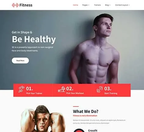

- The most recent update was made in October 2026
- Using the most recent version of WordPress
- The Google fonts have been updated to comply with GDPR and other privacy regulations
- This version is compatible with PHP 8+
- This update is designed to work with at least one page builder (Elementor or Gutenberg)
- This WordPress theme is compatible with popular plugins such as SEO, contact forms, and WooCommerce
- Improvements to performance for popular cache plugins and Cloudflare
For Original price was: $69.00.$41.00Current price is: $41.00.
For Documentation: Click Here
Mobile Friendly WordPress Theme
Today, websites aren’t restricted to desktop viewing. They must function effortlessly across smartphones, tablets and various screen sizes. With the increasing popularity of mobile-first browsing, an adaptive, responsive website is now a must. SKT Adaptive is a contemporary, mobile friendly WordPress Theme designed to ensure seamless performance on all platforms.
A well-structured WordPress mobile-friendly theme can help organise images, content, and layouts so they adapt automatically to the screen size. This ensures that websites are usable, easy to read, and visually uniform. It also works with platforms that allow WordPress theme downloads, which provides greater accessibility to an even larger audience.
How to Create a Mobile Friendly Website that Works on All Devices?
Making a mobile friendly website involves more than just resizing content. It is about creating layouts that adapt to different devices while maintaining clarity and user-friendliness. Websites should ensure that navigation remains easy and that content is readable across all screen sizes.
The mobile friendly WordPress theme offers a layout that allows seamless adjustments without affecting design quality. Sections are laid out to maintain proper spacing and accessibility. This helps websites maintain the same layout even on smaller screen sizes.
Content-oriented sections play an essential part in usability. They make sure that information is clear and free of clutter. This helps to improve navigation and keep browsing smooth across all devices.
A well-structured mobile web page will also facilitate better engagement. Pages load quickly, navigation remains simple, and content remains easily accessible, without unnecessary complexity.
How Does a Mobile Friendly WordPress Theme Improve Accessibility and Performance?
Performance and accessibility are the two most important aspects of today’s web-based design. If websites are not responsive, they are challenging to browse and navigate. A well-organised, mobile-friendly WordPress theme ensures layouts are usable on all devices.
Responsive sections help organise content. Pages change dynamically, ensuring that images, text, and other elements are properly aligned. This enhances the readability and user-friendliness of your website.
Optimised layouts reduce load issues and boost performance. It ensures that websites remain functional under a variety of network conditions. This also aligns with the latest standards for mobile-responsive WordPress themes, where performance and flexibility are crucial.
A responsive, clear design enhances the user experience and ensures websites remain available at all times.
Which Specialised Features are Important for WordPress Mobile Friendly Websites?
Modern websites need performance in terms of responsiveness, speed, and compatibility with a variety of tools. SKT Adaptive includes technical capabilities to meet these needs and ensure a stable performance.
Responsive Design
The mobile friendly WordPress Theme seamlessly adapts to mobile phones, tablets, and computers. This provides the same browsing experience, regardless of the screen size. Responsive design ensures accessibility on all platforms.
Fast Loading Performance
Mobile users expect quick loading times. Optimised performance ensures websites load quickly. This increases engagement and decreases the chance of dropping off.
SEO-Friendly Structure
Clean code and well-organised layouts help search engines better understand content. This improves search engine indexing and rankings for keywords such as “Mobile Friendly WordPress Theme.”
WooCommerce Compatibility
The theme is compatible with WooCommerce, enabling seamless online transactions. This is particularly useful for businesses that use a mobile-friendly WooCommerce strategy for selling online products.
Elementor Compatibility
Pages can be edited using drag-and-drop. This allows for quick updates without technical complexity. This ensures that content stays current.
Gutenberg Support
Block-based editing enables organised content creation. This improves layout flexibility and presentation.
Secure Coding
Security is a must for every website. The theme is based on code that limits the risk of vulnerabilities and ensures the site’s stability.
Demo Import
The pre-built layouts for demos are for rapid installation and setup. Content is easily replaceable, reducing development time.
Cross-Browser Compatibility
The mobile friendly WordPress Theme runs smoothly across the major browsers. This guarantees a consistent experience, regardless of the browser you use.
High-Resolution Support
Visuals and images are clear and sharp on all devices. This enhances the presentation quality.
Scalable Layout
As websites expand, the number of pages and sections can be easily added. This allows for long-term usability and expansion.
Structured Navigation
Clear navigation makes it easier to quickly explore the content. This makes it easier to use and increases engagement.
Stable Framework
The mobile friendly WordPress Theme is built on an established framework that guarantees consistent performance under all circumstances.
Why Does Mobile First Design Matter in WordPress Themes?
Mobile-first design has now become the norm in modern web development. A mobile friendly WordPress Theme focuses on creating designs specifically for small screens before scaling to larger screens.
This method ensures that the most important content is prioritised and easily accessible. It also enhances the user experience and meets search engine requirements.
Mobile-first design reduces complexity and makes sure that websites are usable across devices. This method is often used on platforms listed among the top mobile-friendly WordPress themes. These are the ones where speed and accessibility are top priorities.
Why Choose This Mobile Friendly WP Theme for Long-Term Growth?
A website must not only meet current requirements but also evolve to meet future demands. SKT Adaptive offers a scalable architecture that supports future growth and flexibility.
Pages, sections, and features can be added to the site without affecting its overall layout. This ensures the website remains relevant even as requirements change.
The ability to manage updates effectively is essential to ensuring uniformity. A well-organised theme will help maintain performance while allowing flexibility. This will ensure long-term usability and stability.
Final Thoughts
Mobile-friendly websites are vital for ensuring accessibility, performance, engagement, and speed in today’s web-based environments. A well-structured platform allows you to deliver content with clarity while ensuring users can interact with the site on a variety of devices.
SKT Adaptive provides a professional Mobile Friendly WordPress Theme designed for blogs, businesses and eCommerce platforms. Thanks to its flexible layouts, customizable adaptability, and performance-focused features, it provides a secure solution for creating modern, mobile-friendly sites.
By combining adaptability, usability, and a structured layout, this paid theme can help create websites that function efficiently across all devices and support the long-term growth of digital technology.
Quick links
Categories
- Agency
- Automotive
- Bakery
- Blank
- Blog
- Business
- Cars
- Church
- Construction
- Consulting
- Corporate
- Creative
- eCommerce
- Education
- Elementor
- Empty
- Entertainment
- Fashion
- Fastest
- Food and Restaurant
- Free
- Gutenberg
- Hotel
- LMS
- Magazine
- Marketing
- Medical
- Minimal
- Multipurpose
- News
- Non Profit
- Online Store
- Others
- Photography
- Portfolio
- Real Estate
- Responsive
- Simple
- Single page
- Software
- Spa and Salon
- Sports
- Technology
- Travel
- Wedding
- WooCommerce


© Copyright 2026 Pinnacle Themes.


