
SKT Responsive - Mobile Ready WordPress Theme
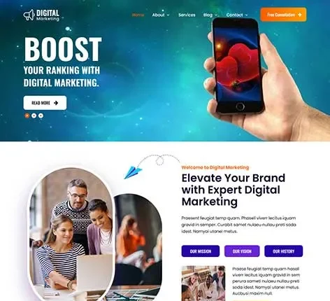

- The most recent update was made in October 2026
- Using the most recent version of WordPress
- The Google fonts have been updated to comply with GDPR and other privacy regulations
- This version is compatible with PHP 8+
- This update is designed to work with at least one page builder (Elementor or Gutenberg)
- This WordPress theme is compatible with popular plugins such as SEO, contact forms, and WooCommerce
- Improvements to performance for popular cache plugins and Cloudflare
For Original price was: $69.00.$41.00Current price is: $41.00.
For Documentation: Click Here
Mobile Ready WordPress Theme
Modern websites aren’t created exclusively for desktops. With the growing use of mobile devices, websites have to perform seamlessly across tablets, smartphones, and various screen sizes. A well-organised and responsive layout is essential to maintaining user-friendliness and engagement. SKT Responsive is an innovative Mobile Ready WordPress Theme designed to ensure smooth performance across all platforms.
A well-designed WordPress Mobile-Ready Theme ensures that images, content, and layouts automatically adjust to screen size. This ensures design consistency and enhances accessibility. It also improves visibility in search results, especially for platforms that offer WordPress theme downloads and aim to reach a wider audience.
Why is a Mobile Ready WordPress Theme Essential in Today’s Web Environment?
Recent trends indicate that most web browsing occurs on mobile devices. Websites that have not been optimised for mobile devices often have issues with layouts that aren’t optimal, slow loading, and difficult navigation.
A modern, mobile ready WordPress theme ensures that content is easy to read, navigation is intuitive, and pages load quickly on smaller screens. This increases overall accessibility while ensuring that sites are usable across different devices.
Businesses that operate using solutions such as an e-commerce WordPress theme benefit from the mobile-friendly design. This allows for seamless product browsing and purchase directly on mobile devices.
How Does This WordPress Mobile Ready Theme Improve Website Performance?
A mobile-friendly design isn’t just about layout, but also about usability and performance. SKT Responsive is an adjustable solution that allows smooth interactions across all devices.
Responsive Layout That Adapts to All Screen Sizes
It automatically adapts the layout to tablet, mobile, and desktop monitors. This ensures the theme is consistent across all devices. It enhances usability and readability. It also improves user experience.
Optimised Navigation for Mobile Browsing
Navigation elements and menus were designed to make navigation easy and accessible. This allows for easy navigation on smaller screens. It helps reduce complexity. It increases engagement.
Flexible Content Structure for Better Display
Content sections are designed to adapt to different screen sizes. This makes sure that text and images stay crystal clear. It also prevents layout breaks. It maintains design balance.
Touch-Friendly Design for Better Interaction
Clickable buttons are optimised for touch interactions. This enhances the mobile user experience. It improves navigation. It facilitates easy browsing.
Why Is a Mobile Ready Theme Essential for SEO?
Search engines favour mobile-friendly websites in their rankings. Mobile-Ready WordPress Themes: Mobile Ready WordPress Themes play a crucial role in improving the visibility of your website in search results.
Mobile responsiveness guarantees that pages load properly across every device. This helps reduce bounce rates and increases engagement. This also helps improve rankings and indexing.
Websites that adhere to mobile-first design principles will rank better in search results. This is why many platforms listed as top WordPress themes focus on mobile-friendly layouts as their primary feature.
How Does This Mobile Ready Theme of WordPress Support Different Types of Websites?
The design of a WordPress Mobile Ready Theme must accommodate diverse industries and usage scenarios. It is a SKT Responsive design that can adjust to the different needs of businesses.
Suitable for Business and Corporate Websites
Companies can clearly present their services by using responsive layouts. This increases accessibility across all devices. It allows professional presentations.
Works for Blogs and Content Platforms
Blogs require layouts that are readable on mobile devices. The theme is designed to ensure proper text formatting. It makes content more accessible. It enhances engagement.
Designed for eCommerce and Online Stores
Stores online benefit from a mobile-friendly theme for browsing and shopping. The Mobile Ready WordPress Theme supports product display across all devices. It makes shopping more enjoyable. It aids in conversion.
Supports Multi-Service Websites
Websites that offer multiple services may maintain a consistent layout across devices. This helps ensure clarity. It increases usability. It helps with scaling.
Which Customization Options Help Maintain a Mobile-Friendly Design?
The importance of customisation is ensuring that a site is flexible and visually consistent. SKT Responsive offers options that provide design flexibility.
Color Customization for Consistent Branding
The colours can be adjusted to align with the brand’s image. This helps ensure consistency in visuals. It helps improve recognition.
Typography Settings for Readable Content
Fonts are optimised for readability on smaller monitors. This increases the clarity of content. It improves the user experience.
Header Layout Customisation for Easy Navigation
Navigation can be arranged to ensure mobile accessibility. This increases usability. It allows for seamless browsing.
Footer Sections for Organised Information
Footer areas are used to display important information and links. This helps organise content. It improves user-friendliness.
Features Available In Mobile Ready Websites
Modern websites require high performance and compatibility to work effectively across different devices. SKT Responsive incorporates features that satisfy these requirements.
Responsive Design
The Mobile Ready WordPress Theme runs seamlessly across tablets, mobile devices, and desktop computers. This guarantees an unbeatable user experience. It is designed to support modern browsing habits.
Fast Loading Performance
Speed is vital to mobile surfing. Optimised performance ensures faster loading. This increases engagement. It also reduces bounce rates.
SEO-Friendly Structure
Clean code helps search engines comprehend content. This improves the ranking of terms such as ‘Mobile Ready WordPress Theme’. It increases the visibility of search results.
WooCommerce Compatibility
The Mobile Ready WordPress Theme is compatible with selling online features. This enables smooth transactions on mobile devices. It enhances the shopping experience.
Elementor Compatibility
Pages can be customised with drag-and-drop tools. This can be used to create a flexible layout. It allows quick updates.
Gutenberg Support
Block-based editing can improve the structure of content. It improves the flexibility of layouts. It helps improve presentation.
Secure Coding
The Mobile Ready WordPress Theme adheres to the coding standards to improve security. This guarantees security and stability. It is a long-term solution.
Demo Import
Pre-built layouts allow for faster setup. Content can be easily customised. This helps speed up the development process.
Cross-Browser Compatibility
The Mobile Ready WordPress Theme is compatible with all the most popular browsers. This guarantees a consistent display. It also improves accessibility.
High-Resolution Support
Images appear sharp across devices. This enhances the quality of the presentation. It enhances design.
Scalable Layout
Pages and sections can be easily added. This helps to grow. It guarantees long-term usability.
Structured Navigation
Clear navigation increases accessibility of content. It decreases confusion. It enhances engagement.
Stable Framework
The Mobile Ready WordPress Theme ensures consistent performance across a variety of circumstances. It provides the reliability. It is ideal for modern websites.
Conclusion
Mobile responsiveness is no longer an option in the modern world of web design. A well-designed website must function continuously across devices to ensure accessibility and engagement.
Mobile Ready WordPress Theme offers a professional Mobile-Ready WordPress Theme designed specifically for blogs, companies, and eCommerce platforms. With responsive layouts, customisation options, and performance-focused features, it offers a secure solution for creating mobile-friendly sites.
Companies looking to appear in mobile-friendly search results can utilise this WordPress theme to build an agile, fast, and user-friendly site that performs well across all mobile devices.
Quick links
Categories
- Agency
- Automotive
- Bakery
- Blank
- Blog
- Business
- Cars
- Church
- Construction
- Consulting
- Corporate
- Creative
- eCommerce
- Education
- Elementor
- Empty
- Entertainment
- Fashion
- Fastest
- Food and Restaurant
- Free
- Gutenberg
- Hotel
- LMS
- Magazine
- Marketing
- Medical
- Minimal
- Multipurpose
- News
- Non Profit
- Online Store
- Others
- Photography
- Portfolio
- Real Estate
- Responsive
- Simple
- Single page
- Software
- Spa and Salon
- Sports
- Technology
- Travel
- Wedding
- WooCommerce


© Copyright 2026 Pinnacle Themes.


