As there are hundreds and thousands of people using smartphones and tablets every day all over the world. Thus, more people use mobile devices to search their queries instead of using desktops.
Hence, one needs to make sure that their website is mobile ready. And if you do not have a mobile responsive website made with cool WordPress themes, then you are losing out on opportunities to reach a larger number of audiences. But there are people that have optimized their website in one or another way.
While optimizing your site for mobile, moving your website’s layout is not enough to engage and convert your mobile visitors. One needs to ensure that their website for mobile is easy to use, designed carefully for small screens and runs fast.
Even if people are not purchasing anything from your website, they still are doing competitive research. If one misses the chance of engaging with them with your mobile website, then you might lose them forever.
Take a look at the below-given tips to get your WordPress website up to that level like the rest of mobile-ready web.
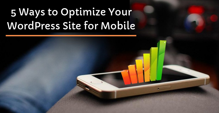
Speed Up your Website
The most important is the load time for any website. If the site does not load fast you will lose your customers and the slow load times will send them to your competitors.
Faster load times increase the conversion rate and decrease the bounce rate. Here are things you need to follow to increase the speed of your website.
i. Optimize your website’s plugins and themes:
In this, you need to optimize your plugins and themes, if you have a major slowdown. You have to update your WordPress, themes, and plugins. If doing this does not fix the issue then you need to deactivate all your plugins until you find the reason.
You might also need to change the theme to the default theme. As soon as you find the problem you can leave it inactive or can to solve it.
ii. Utilize a great web host:
If you are using a cheap shared hosting server then you need to upgrade your hosting services account that will help you to increase the speed of your website made from cool WordPress themes.
Make your Website responsive
Everyone knows about the responsive websites, but only using responsive themes is not enough. Responsive website reacts appropriately according to the device, it is being used on.
With the responsive design, your website can be viewed on all devices, whether it be mobile desktops or tablets. Your website is presented in a different way in every device.
Responsive design focuses on creating an optimal viewing experience across all devices, with the user having to scroll or adjust his or her screen.
As there are thousands of responsive themes in WordPress, once you have installed a cool WordPress themes check that it is working great on all the devices. If you have found the perfect theme for your website then you are all set to go.
Make sure that you consider a mobile app
Only optimizing your website for mobile devices is not enough, as their people are spending their time on a device is spend on their apps.
Part of the mobile device optimization also includes designing your mobile application that will generate a different and great experience for your audiences and also for your business.
The app allows faster and greater user experience, along with the highlights that are not available on the internet.
You can also distribute your app in iOS and Android stores, so you can use it no matter which operating system your device is running. It is a great point of contact to engage with your users.
There are a lot of various ways to create an app for your website, which consist of custom development or a DIY app builder. You can select in which way you want to create your app depending on your budget.
Avoid SEO mistakes
Here the first thing one needs to do is to fetch your WordPress website to see if there are any issues that you do not know about. Once your website is fetched, it will show you errors within your website that you need to fix.
Your website’s font size should be readable on mobile phones. Your articles should be with no sidebars and in one column. Also, ensure that you do not have any of the misconfigured robots.txt files in your site that can block Google from reading your website.
One can also make use of Yoast SEO that will help you improve your site’s SEO, and also helps in detecting errors.
If there is any popup plugin that you might be using, ensure that they do not block the whole screen on mobile phones. Either you can make use of deactivated popups for your mobile.
Ensure that you track your growth
If you have done all the work of optimizing for mobile, ensure to check the growth of how good are you doing. Google analytics can help you track your mobile visitors distinctly from the desktop, utilizing a segmentation feature.
With this one can see how much traffic is on your mobile app and from where it is coming and also can see what pages have been viewed from your users.
For seeing this you need to first log in to your Google Analytics account and then go to the audience. Click on ‘Overview’ then click on ‘Add segment’. This will display you all your available segments, then you can select ‘mobile Traffic’.
One can uncheck all traffic to see your mobile only, or can also leave it checked for comparison. You will see your new segment data after you have clicked the blue apply button below the segments.
After this, you will be able to see the percentage of mobile traffic on your app, for viewing other data you can click on other navigation.
Conclusion
Optimizing your website made from cool WordPress themes for mobile devices does not have to be complicated.
Always monitor your website’s performance on mobile as well as on desktops, so if any error is where you can solve for better user experience. Hope this article helps you in optimizing your website for mobile.

