Web design is the most important aspect of any website. An effective design will help with SEO, user retention, user engagement, low bounce rate, and many such important goals a website needs to achieve.
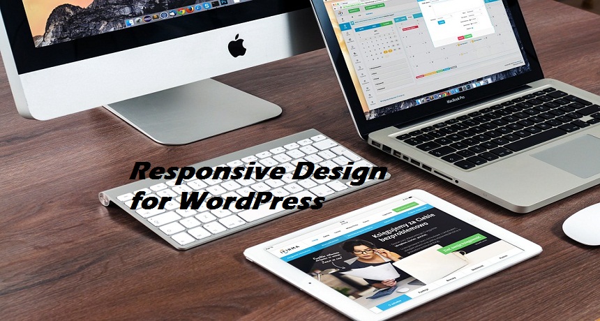
Coming to the part of achieving goals for your website, responsive design is a key element to get there. What is a responsive design? A responsive web design is one where a webpage responds to a particular device it is seen on. In other words, it resizes itself according to the device it is opened on.
Gone are the days when designers made a one size fits all kind of design. Today, you have got to have a design that fits various devices like laptops, PC, tablets, phones, etc. of different sizes.
Users aren’t on their desktops alone. The Internet is on the move along with people’s devices. With a responsive design, your WordPress website can be utilized and optimized a lot more than before.
With almost 80% of Internet users being on smartphones, it’s crucial for your website to work on multiple devices of various sizes. Don’t assume that all these devices support web browsing, so your website doesn’t really need any tweaking.
Each device has different capabilities with regard to browsers, software requirements, hardware specs, and so on. This is why a developer needs to work on a design that is responsive to all kinds of devices. Let’s see what all a responsive device is useful for.
1. SEO Friendly
A responsive web design is SEO friendly. Even if search engines haven’t revealed their SEO criteria, it’s a long known secret that web design is an important one for them to rank a website.
A website with responsive web design has only one URL which works on any design. That’s why this kind of design will help a website perform well in searches.
2. Reduced Bounce Rate
As you know, web design is an important aspect of reducing the bounce rate of a website. With responsive web design, it’s all the truer.
If a website can be browsed, read, and be engaged on, users would stay on the website. If you have recently tweaked your website to a more responsive design, you would see it in your stats. The bounce rate numbers would have gone down.
3. Higher Conversion Rate
A responsive web design adds to your conversion rate. With a website that works brilliantly on all devices, users are more likely to build a connection. Websites that are not easy to access and browse on a smartphone or a tablet have lesser chances of users coming back to them.
This kind web design is important for user experience. A seamless user experience means a higher rate of conversions. That’s what every website looks for today.
4. Rich User Interface
A few years ago a developer could only tweak text and columns of a website to fit a smaller screen. Images and videos couldn’t be touched. If you remember, images would be enlarged in a website when opened on a smaller device.
But today, there’s the flexibility of designing a website in a way that it enriches the user interface giving the users a great viewing experience.
Images can be reduced to fit any device, videos can have thumbnails depending on how small a screen the website is opened on, and other adjustments can easily be made today.
5. Cleaner Content Display
Earlier, content displayed on smaller devices would be terrible looking. One would have to scroll up, down, and even sideways to read the content on a website opened on a smaller device.
But today, you can make the entire content fit in one or two pages, which minimizes any scrolling that a user would need to do.
The same website will open perfectly well on larger devices and screens. Basically, you’re making one website but with a tailor-made display for different devices.
6. Touchscreen and Cursors
Today’s devices are mostly touchscreen ones. But then bigger devices like laptops and PC are cursor based. With a responsive design, you can be assured that your website will work on both.
Touchscreen is very important since it is the modern way of working a device. Your web design must be responsive enough to work with such methods of browsing.
7. Content that Works Across Devices
After all this, if you don’t have content that works on all devices, the responsive design is of no use. Make sure your content is suited for people on the go using smartphones and tablets.
The content should be easy to read and comprehend. Remember, we’re talking about people in cars, walking, public transport, and so on.
The last thing they want is content that cannot be consumed instantly. Don’t hide anything in your content. One click should show everything on one page. Too many backlinks for context isn’t ideal for mobile reading.
There are several themes you can install on WordPress that will help you with responsive web design. Each one would be specific to each need.
For instance, there will be a few for mobile themes and another few for making existing themes responsive. You can get one that fits your needs better.
Making Your Current Theme Responsive
As mentioned, you can make your existing theme responsive instead of hiring a developer or installing a theme. For starters, edit the width of your website, its content area, and sidebars.
The idea is to reduce it to 100%, 75%, and 25% respectively. Keep the margins in consideration while doing this. Simply change the width in percentage instead of pixels and you will have a responsive design.
Being mindful of your website’s design will take you farther than you would have thought. It’s the small things that lead to big impact. If you see the stats, most people are consuming content instead of just reading it.
If your website can give users the content they need while making it easier for them to access and consume it, you are doing everything right to make your website responsive.

