It is no epiphany that mobile is the best available alternative for browsing the web. It overtook the desktop these days.
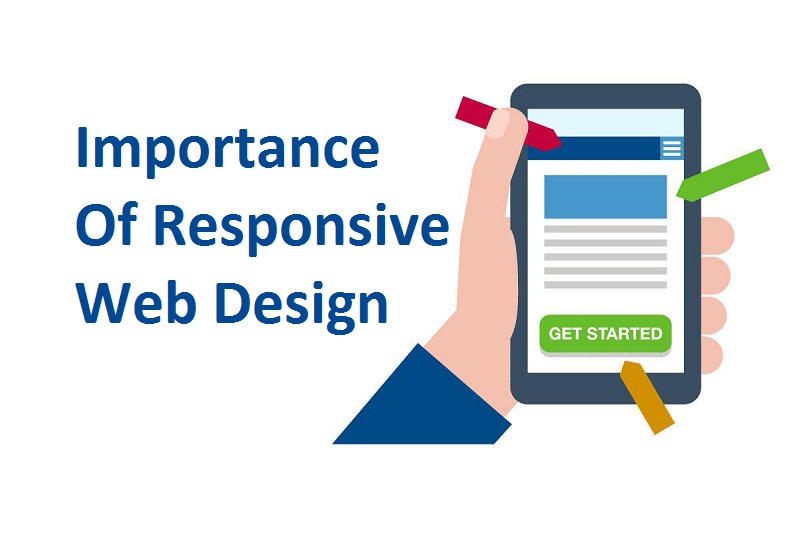
If you are designing any website then how important for it to be responsive? How a responsive design of any website pays off to success of it or any campaign? Here in this blog, we get answers to all these questions. First and foremost question what do you mean by responsive web design?
Introduction to Responsive Web Design:
It is an assortment of techniques by which a website is enabled to acclimate the size of screen or resolution of the screen it is being viewed on.
Consider you are using a website which is responsive, no matter you are opening it in any of the devices like desktop or laptop, the contents will be same, the site can be viewed as it is on both of these devices, the only difference is that the site will have observed the restraint by default and automatically amended to give better experience to the user.
It is now very convenient for any user to access a website from mobile phones also as today’s websites are designed to be responsive. Now websites not needed much loading time and one need not see the contents by zooming in and zooming out.

According to a 2016 report from comScore, 65% of ‘digital’ time is spent on mobile, while the share of desktop time is around 35%. The using rate of mobile phones is increasing per year by approximately 5% and desktop using rate is being kept on decreasing.
There is a necessity these days to design your site to be responsive if one wants their website to succeed. So, after reading all this it has become clear that mobile is always more important then desktop. The popularity of mobile is being kept on increasing day by day.
Now we are going to discuss in detail that why is responsive design is important and advantageous also.
1. Development at lower cost:
If you calculate the cost of developing a responsive website then it is obviously less as compared to developing a standalone mobile application. Also, developing a responsive website take less time.
Just consider if you develop a website with two different versions it will take more time and money as compared to design a responsive website.
If you design two versions of the same website then it will cost more in various future aspects like maintenance cost, configuration cost etc. It could be the possibility that responsive design expense is high initially but afterward, you do not need much money for maintenance and all.
2. Inflation of Mobile traffic:
If you go through any of the articles or latest news you came to know that more then half of the traffic to any of the website comes from the mobile devices. Therefore, it is now increasingly mandatory for companies that they design websites to be responsive.
By doing this user will get a proper website which will fit well with any device and gives a great user experience. Still, of all these some opt for designing two versions of their website one for mobile users and other for desktop or large screens.
3. Faster Loading speed:
When you are designing a responsive web design then it is necessary that you pay attention to loading speed of your site. From different sources it came to know that mobile users would not wait for long.
The maximum limit is one minute. So, one has to use modern techniques like caching techniques to be incorporated into their website so that website will load faster.
4. Analytics reporting will be easier:
It is necessary to gather information regarding traffic- where it is coming from to your the website like from mobile or laptop or device other than that and to identify that how users are interacting with your site.
All this is necessary because based on that one has to make required amendments on their website. If there is only one version of a website(responsive) then it is easy to gather all this information.
But if there is more then one version then it will become difficult to track all these information. One have to check user’s journey from multiple conversion paths, funnels, and redirects. If you have a single responsive web design then it will simplify the tracking process to a great extent.
5. Subside Bounce Rate:
A well designed and well optimized mobile site gives the user a better experience. In turn, it inflates the possibility of keeping users engaged with your site for a longer duration.
In other cases, if your site is not well optimized and responsive. Then it is difficult to keep visitors engaged for a long time with your site.
6. Conversion Rate will be higher:
If your site is getting lower bounce rate then it is a good thing but this is not the end. Obviously one wants visitors of their site to subscribe to their services.
So, when they are deciding for whether or not they want to subscribe your services then at that time they will search for a website which perfectly fits any of the devices so that they can access it, whenever required from any device with ease.
So, if you want new customers then you must have to ensure a positive user experience across all devices.
7. Boost SEO:
If you have designed two different versions of your site. Then it is laborious to manage content across the two different versions. It may be the probability that some of your contents may be duplicated which results in lower SEO rankings.
If you have only one version of your website then you need not worry about duplicated content. This results in improved SEO rankings.
Wrap Up:
These days responsive web design becomes a necessity if you want your website to succeed. You must have to design your website to be responsive. As these days a higher percentage of users prefers to do browsing using mobile devices.

